
01 / Case study
Reclaiming, then evolving, the Pardee brand
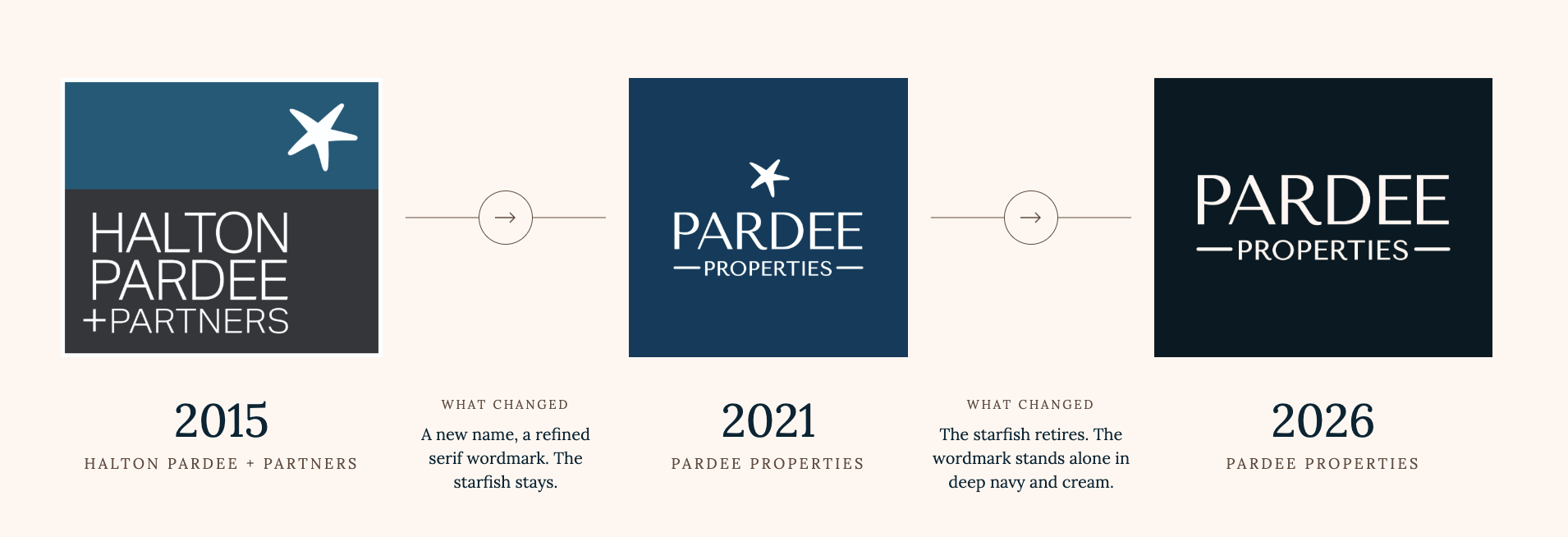
Two brand transformations. One evolving company identity.
The challenge
Help an evolving company compete for larger, higher-end listings without sanding away the personality that made it distinctive.
Context
In 2021, the company reclaimed the Pardee Properties name and built an expressive, founder-connected identity. Five years later, the business needed to feel more elevated, residential, warm and grounded while remaining unmistakably Pardee.
Strategic insight
The 2021 rebrand was about reclaiming identity. The 2026 rebrand was about evolving that identity for growth.
What changed
Decisions made visible.
- 01
Move beyond the geographically narrow starfish mark
- 02
Build a more sophisticated and residential visual system
- 03
Keep color and warmth rather than defaulting to corporate black and white
- 04
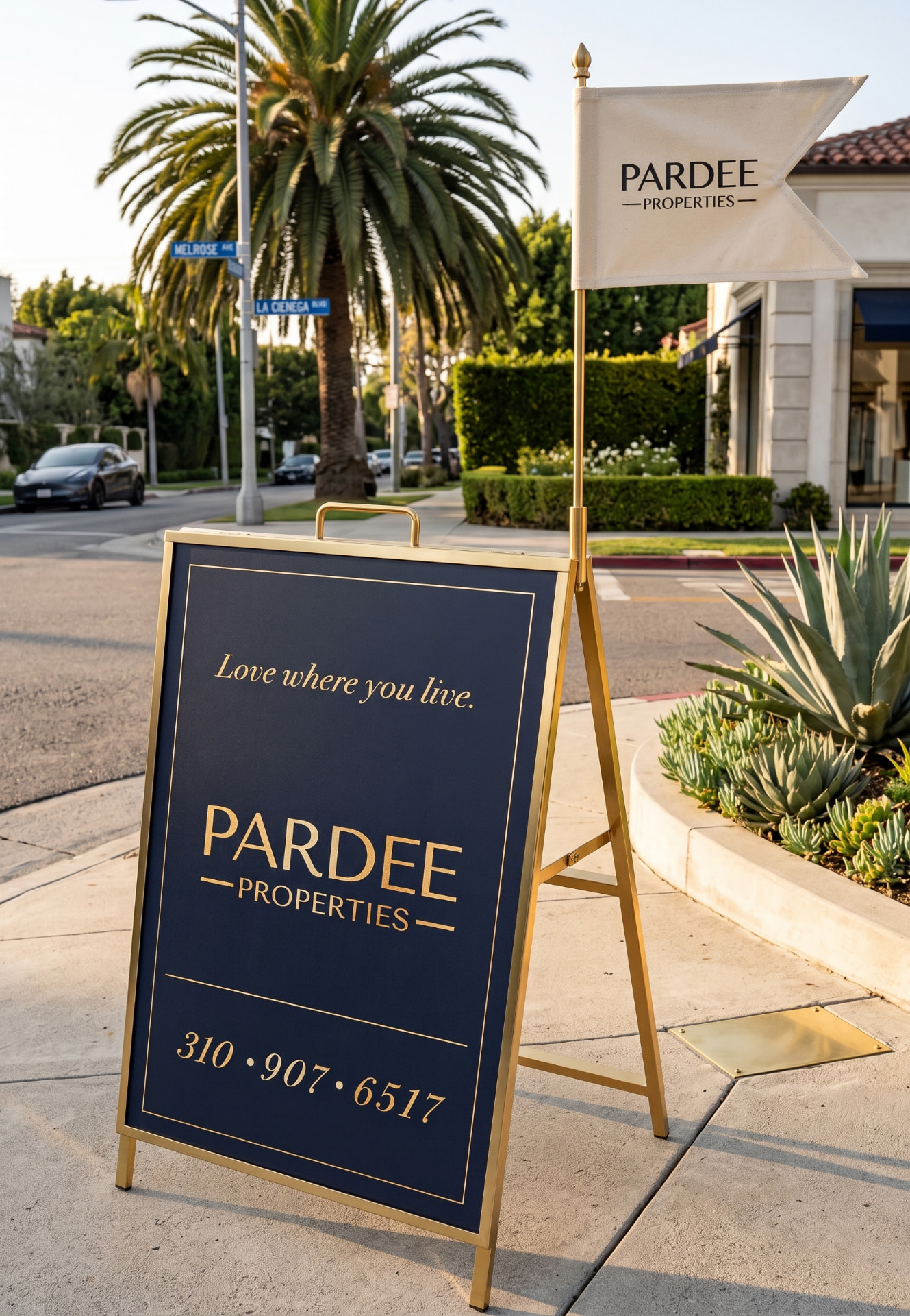
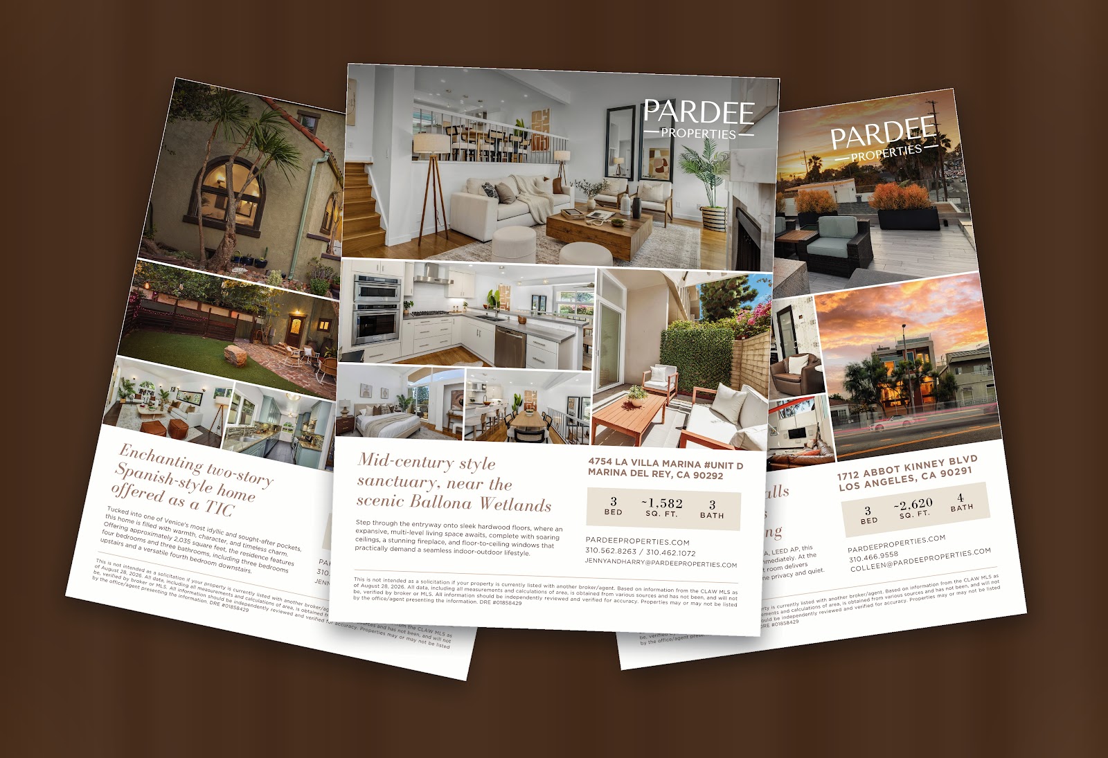
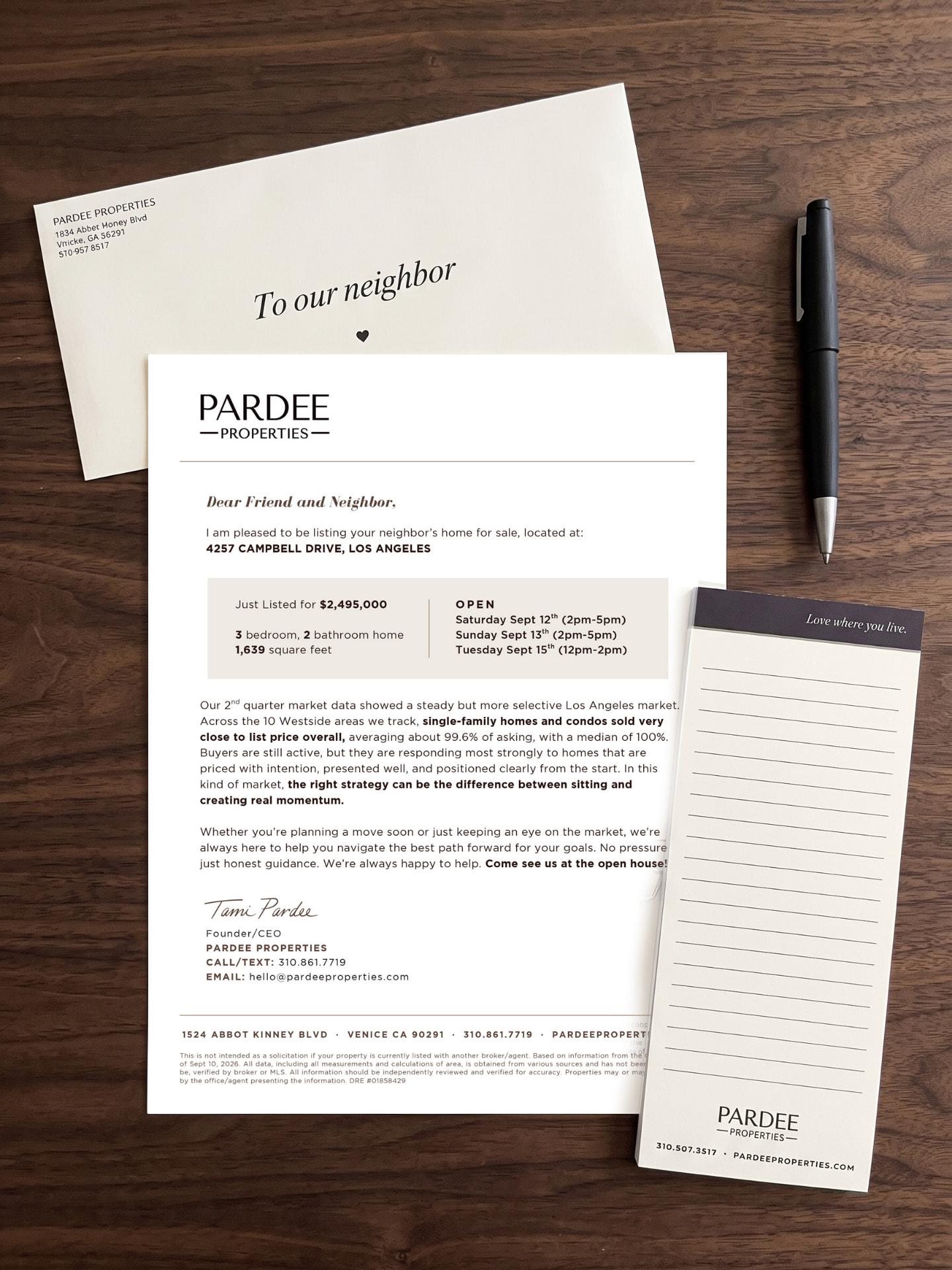
Design rollout logic for 100+ digital, print and physical touchpoints
How the system worked
Visual evidence
The work, in context.
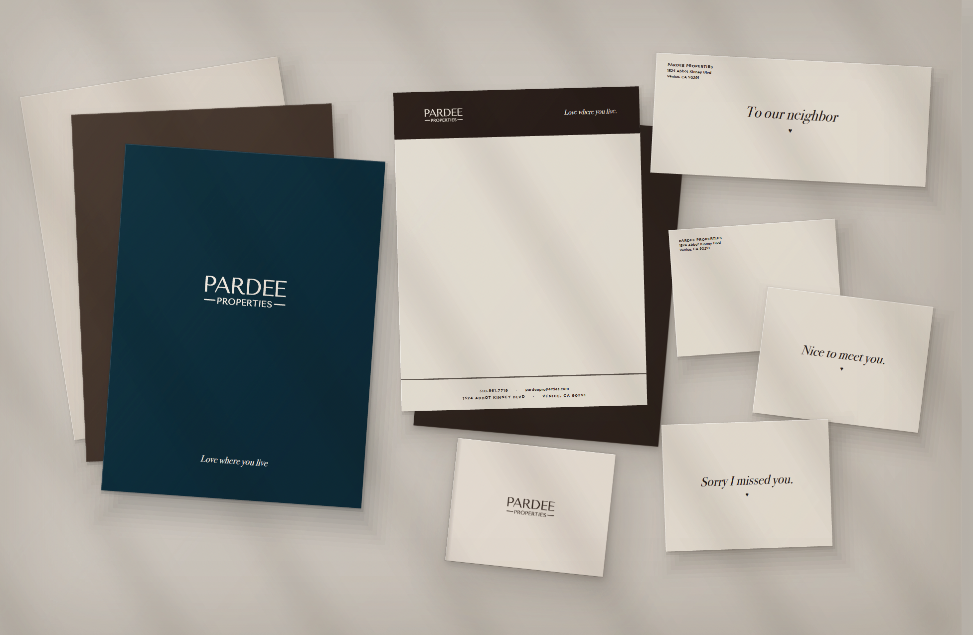
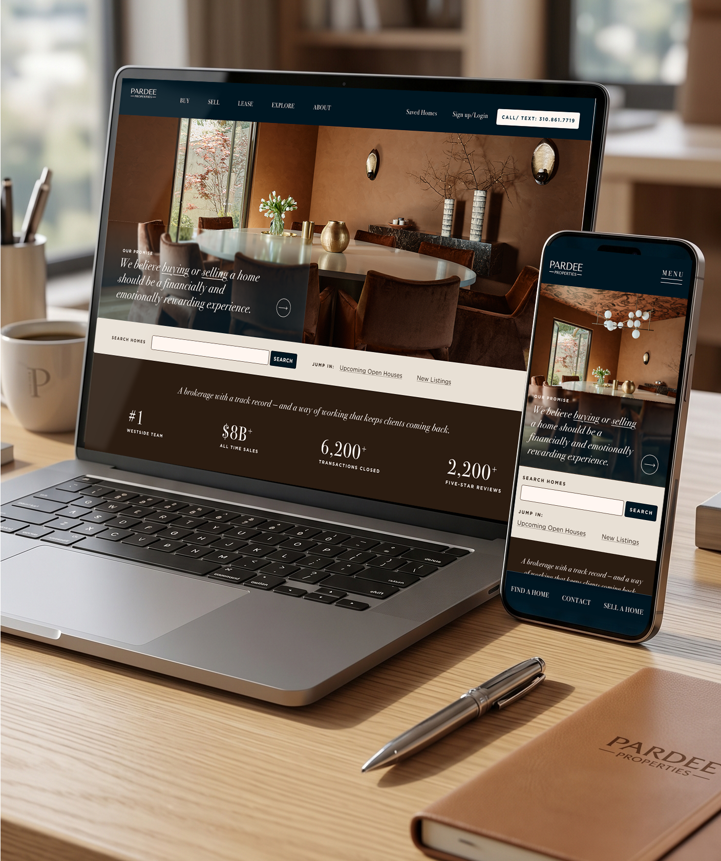
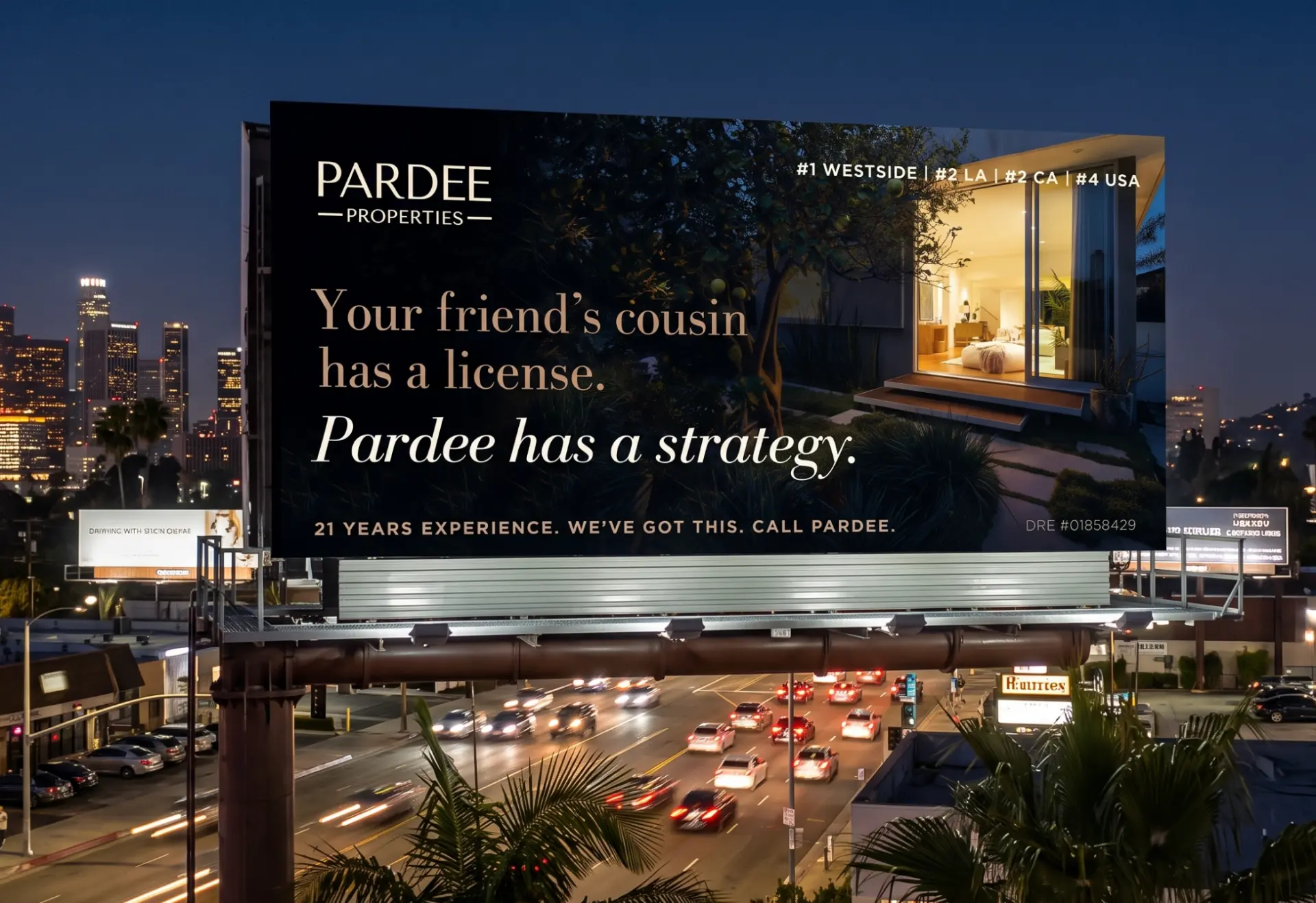
Documented outcomes
Rollout across 100+ touchpoints
A more elevated identity built for growth
What I’d do next
Protect distinctiveness by treating every future touchpoint as part of one living system.